Helmholtz Cloud Portal introduces a better search and keywords

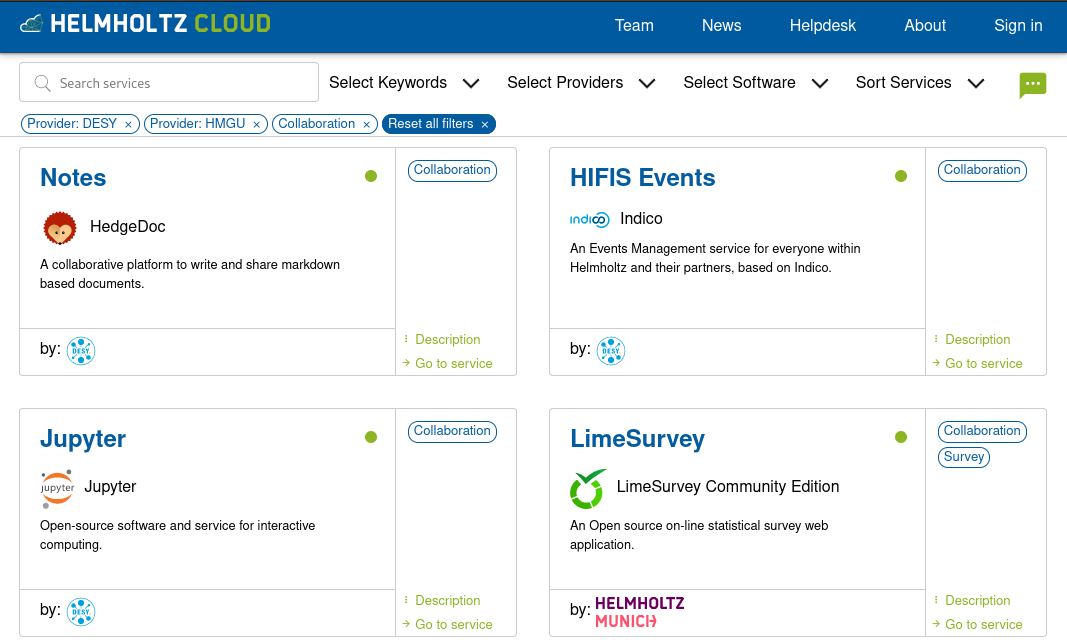
The Helmholtz Cloud Portal just got updated with a new user interface. It has a fresh, clean look, but also introduces new functionalities: We tagged the services with keywords like “Chat” or “Collaboration” that describe the main features of each service.
Apart from giving quick orientation on the service cards themselves, these keywords can be used in two ways: They can be selected as one of three filters (the other two being “Providers” and “Software”) to offer a faceted search. All applied filters are displayed under the search bar and can be separately disabled to fully customise the search result.
Additionally, all filters are represented in the URL which can be used to save the current search and pass it around to colleagues. For example, this link delivers all services tagged with “Infrastructure” and provided by DESY, HZDR, or KIT. The second option to make use of the keywords is to click the keyword on one service card and find all other services with the same keyword.
Now with better mobile view
The Cloud Portal has also been adapted to better work on mobile devices. The service cards and filter bar have been adapted to better fit on smaller screens preserving the same functionality as on the big screen, omitting only the keywords on the cards.
What do you think about the new user interface? We are looking forward to your feedback! Please to not hesitate to contact us.
Changelog
- 2023-01-25 – Reformatted direct link to keyword search
- 2023-05-02 – Update link to filtered Helmholtz Cloud Portal output

