Best Moment Ever
Best Moment Ever
For the following task, put your solution in a separate script exercise_best_moment.py.
Import the already created functions as needed.
Use the same data as in the episodes.
We are looking for hours with really nice weather! Here are the conditions they should fulfill:
| Measurement | Desired values (x) | Comment |
|---|---|---|
| Air Temperature | 15°C ≤ x ≤ 25°C | Comfortable temperature |
| Precipitation (1h) | x = 0mm | No rain |
| Wind speeds | 0 m/s < x ≤ 2 m/s | Slight breeze |
| Sky Condition | x in {2, 3, 4} | Few clouds |
| Time of day | 08:00 ≤ x ≤ 18:00 | Daytime |
1. The Data Part
Find all moments that fulfill the above conditions. Print the timestamps (i.e. date and hour, as in the index) of these moments.
Hints
- Consider building up the filter masks one by one. Combine them later when they all individually work.
- For the sky condition, check out the
.isin(…)-method that creates filter masks based on a sequence - The time of day is part of the index.
Fortunately, pandas has the
.between_time(…)filter. Note that this filter applies directly and does not produce a filter mask first.
Expected Result
| 2020-04-25 17:00:00 | 2020-08-05 13:00:00 |
| 2020-06-21 14:00:00 | 2020-09-03 11:00:00 |
| 2020-06-26 09:00:00 | 2020-09-06 12:00:00 |
| 2020-06-29 08:00:00 | 2020-09-07 15:00:00 |
| 2020-07-01 18:00:00 | 2020-09-27 17:00:00 |
| 2020-07-05 14:00:00 | 2020-09-29 09:00:00 |
| 2020-07-08 12:00:00 | 2020-09-30 17:00:00 |
| 2020-07-11 08:00:00 | 2020-10-02 17:00:00 |
| 2020-07-23 13:00:00 | 2020-10-05 17:00:00 |
| 2020-08-05 11:00:00 |
There should be 19 entries in the final result. Pretty formatting the print output is optional, any formatting will do.
2. The Plotting Part
For the following task, create a new module timeline.py.
Since creating timelines that work with any sequence of dates can become rather tricky, we will break this down into steps.
The Foundation
To get started, we want to solve plotting some dots along a line where the dates indicate an event happening. We do not care about any axis or decoration (yet).
Define a function _plot_timeline(dates, y_offset=0).
The function name starts with an _ to signify that it is a helper that normally should not be used on its own.
| Parameter Name | Type | Comment |
|---|---|---|
dates |
DatetimeIndex |
For each of the timestamps a dot should appear on the timeline. |
y_offset |
int |
The position on the y-axis that the timeline should be plotted at. |
The y-offset becomes important when we later want to plot multiple timelines at once, so they don’t get plotted on top of each other.
If we only want to plot one timeline, using a default value of 0 should be fine.
Inside the function, the following happens:
- An
axhline(…)is drawn at they_offset. Suggested parameters for a nice look arelinewidth=10for a thick linecolor="lightgray"so it does not take away the attention from the markersalpha=0.75to add transparency and blend it better with the background
plot(…)thedates.- Each of them has a y-position according to the
y_offset. - Use
marker="|"andmarkersize=10to get a nice bar-shaped marker at every position. - Further use
linewidth=0to make the lines connecting the individual data points invisible.
- Each of them has a y-position according to the
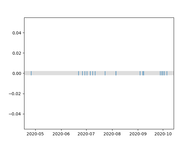
How it could look now
Suppose your final data frame in part 1 was called result.
>>> from matplotlib import pyplot
>>> from timeline import _plot_timeline
>>> _plot_timeline(result.index)
>>> pyplot.show()
Should produce something like this:

Building on top
We now want to build on top of what we already have. Usually we might want to plot multiple timelines to compare them.
Let’s define a second function in timeline.py which we call plot_timelines_at_year(…).
This is the function people are actually supposed to use to plot a timeline.
The function needs two parameters:
| Parameter Name | Type | Comment |
|---|---|---|
year |
int |
The year for which to draw the timeline. |
labelled_dataframes |
dict[str: DataFrame] |
(See below) |
The idea of the labelled data frames is as follows:
We let the user specify data frames associated with a text label. These text labels are what we will plot onto the y-axis for the respective timeline.
Although we only need the index of the data frames for the timeline, we accept the whole data frame for the users’ convenience. We assume that the index is made up of timestamps (otherwise creating a timeline would make little sense).
Here are the steps you want to take within the function:
- Get the amount of entries in the
labelled_dataframesdictionary and store it in a variable. You are going to need this quite often. - Create a
Timestampfor the first and last moment in the year that is to be processed.- The
Timestampclass can be imported from pandas.
- The
- Use pandas
date_range(…)-function to generate a sequence of timestamps from the start of the year to the end.- You will later use them for the x-axis tick marks.
- To get one timestamp at the beginning of each month, use the parameter
freq="MS"
- Since the timeline is usually rather wide instead of high, start your plot by using
pyplot.figure(…). Recommended values for thefigsize-parameter would be12in the x-direction- The amount of timelines to plot in the y-direction.
- Note that
figsizeexpects to be given a tuple of the shape
(width along x-axis,height along y-axis)
- Plot all the timelines using the helper function from before.
- Since our intention is to plot the timelines above each other, each of then uses a different
y_offset. - If you combine a
forloop with Pythons’enumerate(…)-function and the dictionaries.items()you get a nested tuple of the shape(y_offset, (label, dataframe))as a loop variable which can work nicely with our_plot_timeline(…)-function.
- Since our intention is to plot the timelines above each other, each of then uses a different
- During the loop also build up a list with the used y-offsets and a list with the labels that you can use later to set the y-axis tick marks.
- Use the collected lists from step 5 to set the y-axis ticks accordingly.
- Set the limits of the y-axis to
-1(bottom) and the amount of timelines (top) so we have some nice space around our timelines. - Set the limit of the x-axis from the years’ start to the end.
- Set the ticks on the x-axis to the values defined in step 3.
You can refine the tick labels by using the
month_name()-method of theTimestampto obtain the month name as a text. - Enable the grid for the x-axis only.
- Use
pyplot.tight_layout()to achieve a much nicer formatting of your plot.
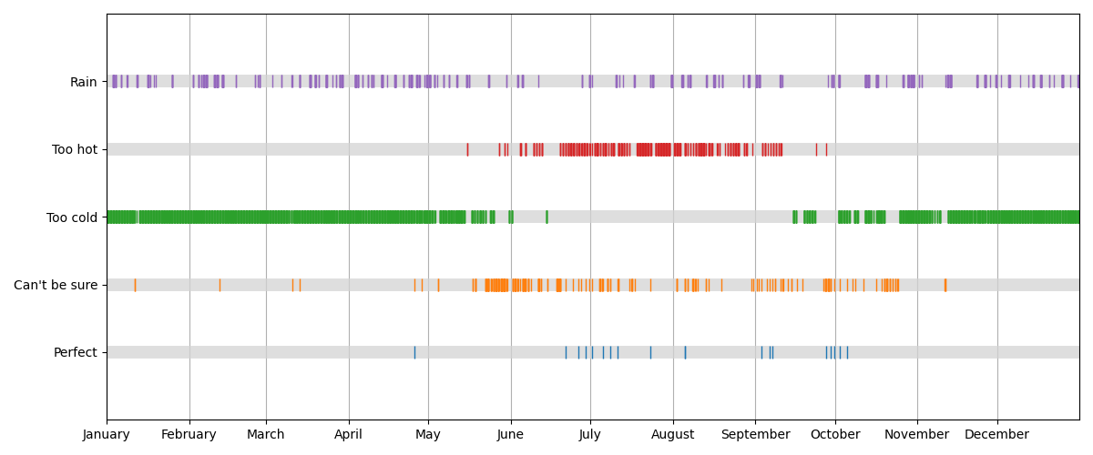
How it should look now
Suppose your final data frame in part 1 was called result.
>>> from matplotlib import pyplot
>>> from timeline import plot_timelines_at_year
>>> plot_timelines_at_year(2020, {"Perfect": result})
>>> pyplot.show()
It should look something like this:

Plot them all!
Now that we have all the pieces in place it has become feasible to apply more filters and also add their timelines to compare.
Filter the weather data for the following conditions and add them to the timeline plot:
| Label | Condition |
|---|---|
| Perfect | (Already did this) |
| Can’t be sure | (See note below) |
| Too hot | Air Temperature > 25°C |
| Too cold | Air Temperature < 15°C |
| Rain | Precipitation (1h) > 0mm |
The Can’t be sure case is a bit special. If we investigate the columns for wind speed and sky condition a bit further, we notice that they have many missing values. Also sometimes the air temperature is not defined. This narrows down the amount of truly perfect moments we find since in many cases we are missing crucial information. To counter this we create a new filter rules to explore additional candidates:
| Measurement | Desired values (x) | Additional rule |
|---|---|---|
| Air Temperature | 15°C ≤ x ≤ 25°C | must be defined |
| Precipitation (1h) | x = 0mm | must be defined |
| Wind speeds | 0 m/s < x ≤ 2 m/s | or undefined |
| Sky Condition | x in {2, 3, 4} | or undefined |
| Time of day | 08:00 ≤ x ≤ 18:00 |
In all cases, limit the results to the time between 08:00 and 18:00.
How it may look
For comparison, here are the amount of rows of the resulting data frames that are plotted:
| Label | Rows |
|---|---|
| Perfect | 19 |
| Can’t be sure | 232 |
| Too cold | 2272 |
| Too hot | 389 |
| Rain | 344 |

If you want a bigger challenge
Instead of taking the year as a parameter derive it from the provided indexes. Note that it then influences the resolution of your grid, so you will have to adapt the tick marks and labels dynamically. This could for example happen if you suddenly have a data that spans a whole decade or if various data sets cover timespans half a century apart.