Multiple Plots in One
With the functions plot_column(…) and plot_column_statistics(…) in place
a lot of the detail work already has been done.
It is now time to tie all the pieces together.
Recap: Multiple Plots in one Axes
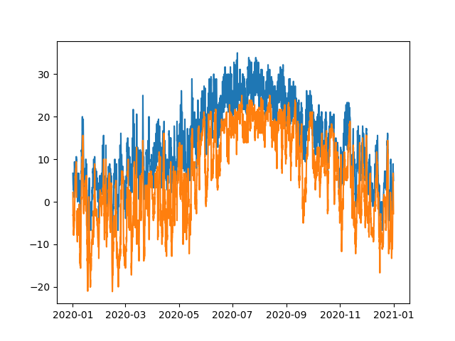
We can plot multiple things into one drawing area, which is called the axes.
Example
Multiple Axes in one Figure
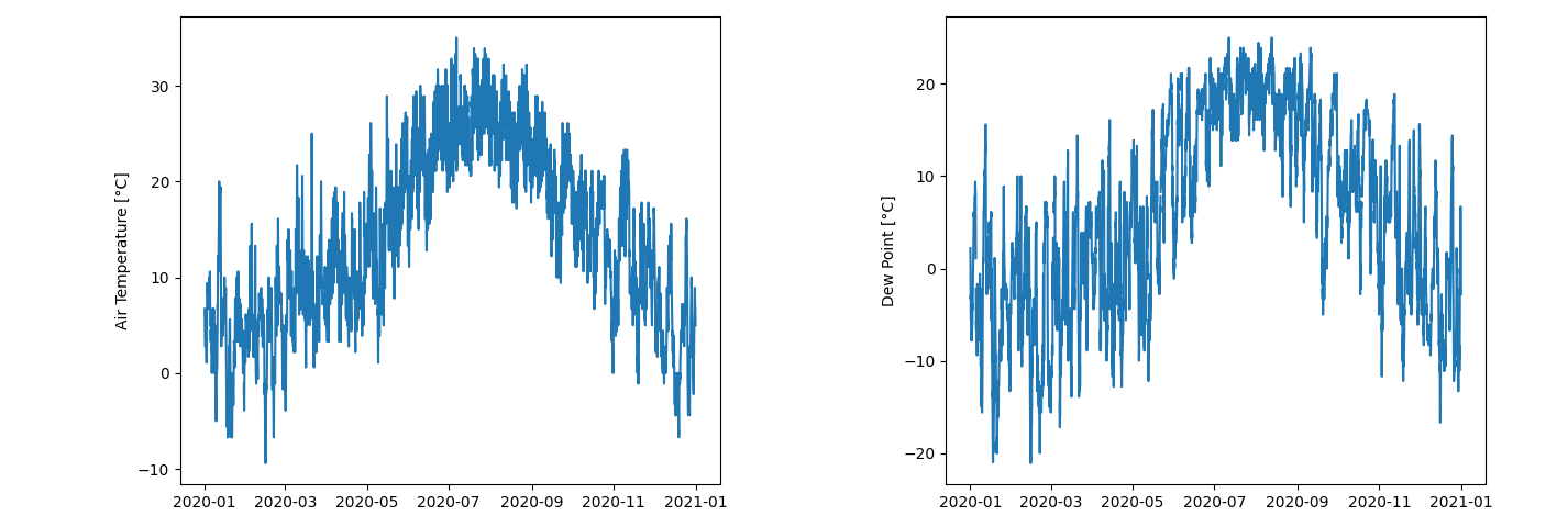
Another way would be to set up multiple independent drawing areas in one figure. Is is usually done to keep plots close together that are related, but have different requirements for the x/y-axis.
Pyplot can help by provoding a function to organize multiple axes.
With pyplot.subplots(…) you can define how many rows and columns you would like in your figure.
Using pyplot.sca(…) allows you to select the axes to draw on.
Note
sca stands for Set Current Axes.
There is also gca to Get the Current Axes.
Example
Let us set up a simple example using two axes next to each other as columns.
The approach using pyplot.subplots(…) is neat for smaller, easier layouts.
If you want to have something more complex however, it quickly becomes quite laborious.
At this point we have to leave the convenience of pyplot behind for a bit and dive deeper into the framework.
Combined Plot - the Idea
Our final plot should allow users to specify a data frame and a list of column names in this data frame which they wish to plot.
We will rely on the already established plot_column(…) and plot_column_statistics(…) functions to take care of details.
So our main concern is the layout.
Since for the same data, the line plot and the box plot share the same y-axis, it would be a good idea to put them next to each other. Further, all columns share the same index, which becomes the x-axis, so we want to align them on top of each other.
This leads to the following layout:
The axes have already been marked as they will be arranged as well as some helper variables. These will come into play in the next step.
Potential for confusion
It also worth to point out that the columns in the data frame will be rows in the plot layout.
The GridSpec-class
For more complex layouts, there is the GridSpec-class to allow for fine tuning.
This is also what pyplot.subplots() uses under the hood.
To leverage the flexibility we are about to get, let us create a helper function
plot_evaluation(dataframe, column_labels) that takes a data frame and a sequence of column labels.
For each of the labels plots the column data on the left along with the respective boxplot to the right of it.
Let us set up this function in plotting.py as well since the functions to plot the individual parts are there already.
from matplotlib.gridspec import GridSpec

# Previous imports and functions omitted for brevity

def plot_evaluation(dataframe, column_labels):
    """ Plot an evaluation of a given set of columns from a data set.

        Each dataset column will become a row within the figure.
        On the left side of each row, the actual data will be plotted
        and on the right, a boxplot will show the significant statistical
        properties.

        Args:
            dataframe:
                The pandas dataframe which contains the rows to be plotted
            column_labels:
                A sequence of labels, representing the data columns
                to be included in the figure.
    """

    # Each dataset column gets their own row in the plot
    plot_rows = len(column_labels)

    # Specify the layouting properties of the grid we want
    grid_layout = GridSpec(
        nrows=plot_rows, ncols=2,
        wspace=0, hspace=0.1,
        width_ratios=[5,1]
    )

    # Create the figure on which to draw
    figure = pyplot.figure(figsize=(12, 3 * plot_rows))
With the grid and figure set up, we can now add the individual axes for each data column.
A lot of the detailed work can be done by the functions plot_column(…) and plot_column_statistics(…)
that we already set up.
from matplotlib.gridspec import GridSpec

# Previous imports and functions omitted for brevity

def plot_evaluation(dataframe, column_labels):
    """ Plot an evaluation of a given set of columns from a data set.

        Each dataset column will become a row within the figure.
        On the left side of each row, the actual data will be plotted
        and on the right, a boxplot will show the significant statistical
        properties.

        Args:
            dataframe:
                The pandas dataframe which contains the rows to be plotted
            column_labels:
                A sequence of labels, representing the data columns
                to be included in the figure.
    """

    # Each dataset column gets their own row in the plot
    plot_rows = len(column_labels)

    # Specify the layouting properties of the grid we want
    grid_layout = GridSpec(
        nrows=plot_rows, ncols=2,
        wspace=0, hspace=0.1,
        width_ratios=[5,1]
    )

    # Create the figure on which to draw
    figure = pyplot.figure(figsize=(12, 3 * plot_rows))

    for plot_row_index, label in enumerate(column_labels):
        column = dataframe[label]

        # Line plot on the left
        figure.add_subplot(grid_layout[2 * plot_row_index])
        plot_column(column)

        # Box plot on the right
        figure.add_subplot(grid_layout[2 * plot_row_index + 1])
        plot_column_statistics(column)
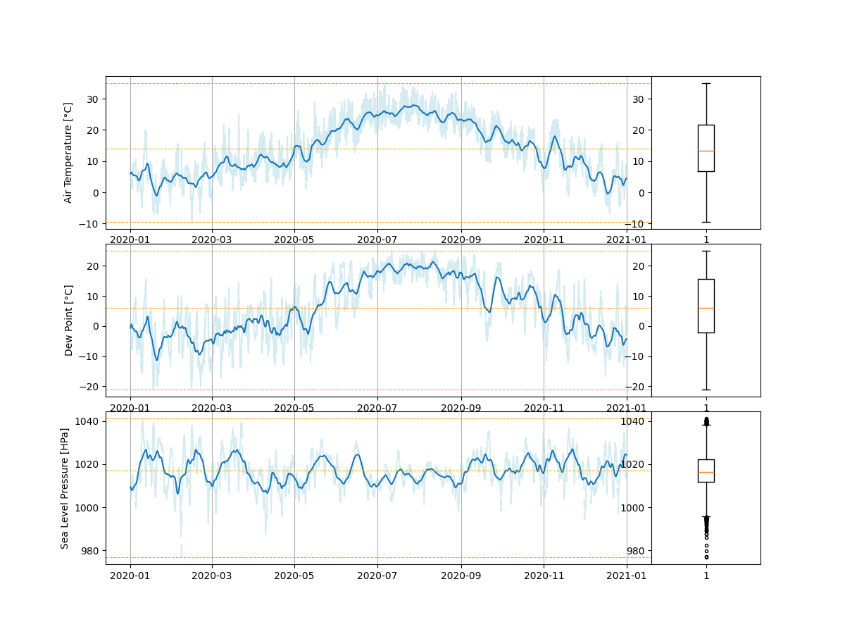
With this function we now already have a quite advanced and flexible way to plot a rather complex analysis with a few starightforward lines of code.
Refinements
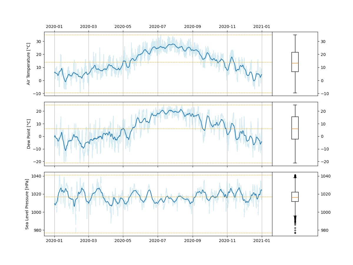
The majority of the work left is fine-tuning the appearance so it not only plots the information we want but also puts the axis ticks and labels outside of the plot and adjusts the arrangement to leave enough space for these elements.
To do this we can take advantage of the fact that all the line plots share the same x-axis and the plots in each row share the same y-axis.
from matplotlib.gridspec import GridSpec

# Previous imports and functions omitted for brevity

def plot_evaluation(dataframe, column_labels):
    """ Plot an evaluation of a given set of columns from a data set.

    Each dataset column will become a row within the figure.
    On the left side of each row, the actual data will be plotted
    and on the right, a boxplot will show the significant statistical properties.

    Args:
        dataframe:
            The pandas dataframe which contains the rows to be plotted
        column_labels:
            A sequence of labels, representing the data columns
            to be included in the figure.
    """

    # Each dataset column gets their own row in the plot
    plot_rows = len(column_labels)

    # Specify the layouting properties of the grid we want
    grid_layout = GridSpec(
        nrows=plot_rows, ncols=2,
        wspace=0, hspace=0.1,
        width_ratios=[5,1]
    )

    # Create the figure on which to draw
    figure = pyplot.figure(figsize=(12, 3 * plot_rows))

    for plot_row_index, label in enumerate(column_labels):
        column = dataframe[label]

        # Line plot on the left
        axes = figure.add_subplot(grid_layout[2 * plot_row_index])
        plot_column(column)

        # Top axes should have its x-axis on the top,
        # Axes in the middle should not have an x-axis at all
        if plot_row_index == 0:
            axes.get_xaxis().set_label_position("top")
            axes.get_xaxis().tick_top()
        elif plot_row_index != plot_rows - 1:
            axes.get_xaxis().set_ticklabels([])

        # Box plot on the right
        axes = figure.add_subplot(grid_layout[2 * plot_row_index + 1])
        plot_column_statistics(column)

        # No need for an x-axis here
        # Move the y-axis to the right
        axes.get_xaxis().set_visible(False)
        axes.get_yaxis().set_label_position("right")
        axes.get_yaxis().tick_right()
Now the same example as above produces even nicer output.
Doesn’t that look awesome?
Code Checkpoint
You can download the current state of the code files here:
Key Points
- Multiple plots can be arranged using the pyplot
subplots()-function - Additionally one can employ the
GridSpecclass for more complex cases - In each case the axes need to be selected and modified individually


