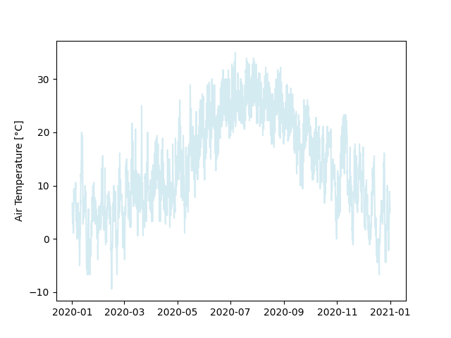
To get a good impression of the data set, let us start by creating some plots. A first intuition would be to plot the data in one of the columns, so let’s start with that.
Plotting a Column
Instead of adding the code directly in __main__.py, we will define it as a function in plotting.py
so we can re-use it for other columns later on.
from matplotlib import pyplot
from pandas import Series

def plot_column(column: Series):

    pyplot.ylabel(column.name)
    pyplot.plot(column, color="lightblue", alpha=0.5)
We also have to adapt our main script a bit to make use of our new plotting function.
from matplotlib import pyplot
from pathlib import Path
from processing import prepare_data
from plotting import plot_column
import label

# Adapt this depending on where you saved the file
data_file = Path("data/725053-94728-2020.gz")
""" Path to the data file which is to be processed """

weather_data = prepare_data(data_file)

# Let's plot the air temperature as an example
plot_column(weather_data[label.AIR_TEMP])

pyplot.show()
Output

The resulting plot is already somewhat informative, but we can improve it further by helping with orientation and outlining some features.
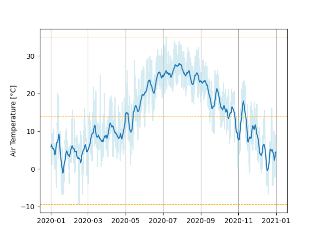
First, we are going to add a few grid lines along the x-axis.
from matplotlib import pyplot
from pandas import Series

def plot_column(column: Series):

    pyplot.ylabel(column.name)
    pyplot.plot(column, color="lightblue", alpha=0.5)
    pyplot.grid(axis="x")
Next, let us add horizontal lines along the minimum, mean and maximum value. We can let pandas calculate the values for these as well.
from matplotlib import pyplot
from pandas import Series

def plot_column(column: Series):

    pyplot.ylabel(column.name)
    pyplot.plot(column, color="lightblue", alpha=0.5)
    pyplot.grid(axis="x")

    for y_value in [column.min(), column.mean(), column.max()]:
        pyplot.axhline(
            y=y_value, color="orange",
            linestyle="dashed", linewidth=0.75
        )
Finally we observe that the plot is pretty noisy, because the data is very fine-grained and varies a lot across a day. A possible solution would be to calculate a rolling average over a certain time span window and plot that instead. The wider we select this rolling window to be, the smoother its plot will become, until it approaches the overall average. Since it also depends on the data we have, and the smoothness we want, we may provide the rolling window as a parameter with a sensible default.
from matplotlib import pyplot
from pandas import Series, Timedelta

def plot_column(column: Series, window_size: Timedelta = Timedelta(days=7)):

    # Generate the data based on the rolling mean
    rolling_mean = column.rolling(window_size, center=True).mean()

    pyplot.ylabel(column.name)
    pyplot.plot(column, color="lightblue", alpha=0.5)
    pyplot.plot(rolling_mean, label="7-Day Mean")
    pyplot.grid(axis="x")

    for y_value in [column.min(), column.mean(), column.max()]:
        pyplot.axhline(
            y=y_value, color="orange",
            linestyle="dashed", linewidth=0.75
        )
As a final touch for this function, it needs a proper documentation.
from matplotlib import pyplot
from pandas import Series, Timedelta

def plot_column(column: Series, window_size: Timedelta = Timedelta(days=7)):
    """ Prepare a default plot for the data in a column.

        Prepare a plot using matplotlib.pyplot.
        You can use pyplot to either show or save the generated figure
        afterwards or modify it further.
        It will plot the data itself, overlaid with a smoothed curve obtained
        by using a rolling mean.
        Dashed lines will indicate the minimum, mean and maximum values.

        Args:
            column:
                A pandas Series, containing the measurements.
                The index should be timestamps.
            window_size:
                A Timedelta indicating the width of the rolling window used to
                plot the smoothed version of the original data.
                (Default: 7 days)
    """

    # Generate the data based on the rolling mean
    rolling_mean = column.rolling(window_size, center=True).mean()

    pyplot.ylabel(column.name)
    pyplot.plot(column, color="lightblue", alpha=0.5)
    pyplot.plot(rolling_mean, label="7-Day Mean")
    pyplot.grid(axis="x")

    for y_value in [column.min(), column.mean(), column.max()]:
        pyplot.axhline(
            y=y_value, color="orange",
            linestyle="dashed", linewidth=0.75
        )
Output

Plotting Column Statistics
Besides plotting actual data it often is also desired to visualize the statistical characteristics of a data set.
For this purpose we can use a box plot.
These box plots can display statistical measures like averages, quartiles, ranges and outliers.
A pyplot.boxplot()-function is included in matplotlib, however it can not deal with data sets including missing values.
As a consequence we have to filter the data set beforehand.
In a similar fashion to the plot_column(…)-function, let us also establish a plot_column_statistics(…)-function in plotting.py.
from matplotlib import pyplot
from pandas import Series, Timedelta

def plot_column(column: Series, window_size: Timedelta = Timedelta(days=7)):
    ... # Cut for brevity

def plot_column_statistics(column: Series):
    """ Prepare a box plot to show statistical properties of a data column.

        Prepare a plot using matplotlib.pyplot.
        You can use pyplot to either show or save the generated figure
        afterwards or modify it further.
        Since box plots can not deal with missing values,
        these will be omitted.

        Args:
            column:
                A pandas Series, containing the data to do the
                statistical evaluation on.
    """

    # Boxplots can not deal with the NaN-values
    # Create a filter mask, asking for data that is not NaN
    data_present = column.notna()

    # set up the boxplot
    # Apply filter on the column and use the result as input for the plot
    pyplot.boxplot(
        column[data_present],
        flierprops=dict(marker=".")  # A trick to get smaller outlier markers
    )
Now we have to combine these two plotting functions to tie them together into a grid, so we have the values over time and the statistics next to each other for as many columns as we like.
Key Points
- It can be useful to outsource parts of plotting code into functions to make them re-usable
- Pandas has functionality to apply rolling window operations on data sets
- There are multiple plot types supported by matplotlib