Task 03: Experimenting with Various Plot Types
a) Polar Plot
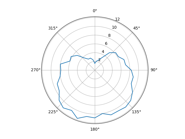
Polar plots are well suited for data of repeated processes or with reference to an orientation.
Data
Here is some data from a weather station, measuring the average wind speeds (in m/s) over a year:
directions = [angle for angle in range(0, 360, 10)]  # 0°, 10°, 20°, …, 350°
wind_speeds = [
    1.07, 2.07, 2.47, 3.32, 5.22, 6.22,        #   0° …  50°
    6.19, 7.08, 7.12, 8.33, 8.91, 8.85,        #  60° … 110°
    9.94, 10.71, 10.96, 10.71, 10.83, 10.03,   # 120° … 170°
    10.87, 10.71, 11.69, 10.59, 11.21, 10.65,  # 180° … 230°
    9.38, 9.13, 8.05, 7.77, 7.99, 6.06,        # 240° … 290°
    6.24, 5.25, 3.62, 2.92, 2.93, 2.41         # 300° … 350°
]
Now you!
Display the average wind speed in a polar plot.
There will be an open segment between the last and the first element.
To close the polar plot you will need to repeat the first element of the direction and wind_speeds list at the ends of the respective list.
Potential Pitfall
Polar plots expect the angles to be given in radians. You can convert from degrees to radians with the formula
A bit more tricky: On a compass, 0° is North and therefore at the top, and 90° points to the East and is therefor located on the right side. Adjust your plot so it matches the proper compass directions.
Expected Output
b) Bar Chart
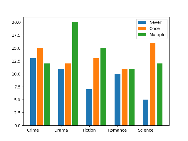
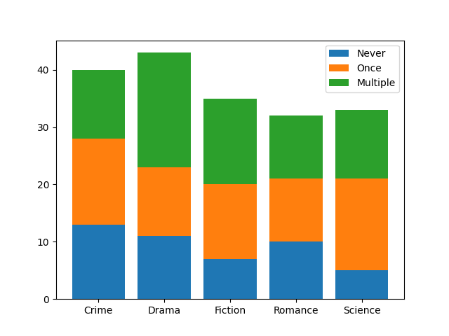
Bar charts are commonly used for categorized data.
Data
Here are some statistics on book rentals from a library.
categories = ["Crime", "Drama", "Fiction", "Romance", "Science"]

# Book rentals for each category classified by popularity for a month
books_rented_never = [13, 11, 7, 10, 5]
books_rented_once = [15, 12, 13, 11, 16]
books_rented_multiple = [12, 20, 15, 11, 12]
Now you!
Plot each of the categories in
- A bar chart with each of the classifications side-by-side
- A stacked bar chart per category
Hints
- You will have to do a lot of manual work, calculating the bar positions and sizes in this one. Better keep pen and paper ready to figure out which bar goes where first.
- For the implementation, maybe the built-in function
enumerate()can prove useful. - You could also consider re-ordering the data, since pure lists are not the most comfortable choice for this use case.
- On a further note, here is a nice comparison how to do bar charts in various plotting frameworks.
Expected Output
c) Scatter Plot
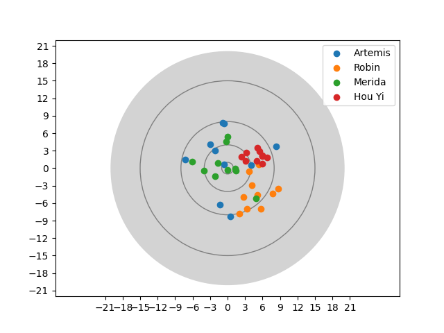
Some famous archers are holding a competition. Each can shoot ten arrows and the shot locations are recorded on a coordinate grid with the bullseye in the center.
Data
# The hits are given as a list with 10 coordinates of the form (x, y)
arthemis_hits = [
    (-1.3, -6.22), (-0.63, 0.59), (0.46, -8.34), (4.08, 0.52), (8.32, 3.73),
    (-2.96, 4.09), (-0.78, 7.81), (-2.19, 2.97), (-7.24, 1.43), (-0.54, 7.69)
]
robin_hits = [
    (7.73, -4.41), (3.71, -0.52), (2.76, -4.99), (3.33, -6.93), (5.32, 0.66),
    (4.19, -2.93), (5.76, -6.96), (8.69, -3.47), (2.0, -7.76), (5.15, -4.62)
]

merida_hits = [
    (-0.02, 5.35), (-4.0, -0.44), (1.47, -0.46), (-0.04, -0.29), (-1.62, 0.93),
    (-6.06, 1.13), (4.91, -5.17), (1.34, -0.09), (-2.17, -1.41), (-0.26, 4.58)
]

hou_yi_hits =[
    (6.76, 1.82), (5.95, 2.02), (5.95, 2.23), (3.22, 2.67), (5.92, 0.73),
    (2.41, 1.96), (5.0, 1.29), (5.42, 2.93), (3.08, 1.19), (5.11, 3.52)
]
Your own competition
In case you would like to hold your own archery contest, here is the function that generated the data:
from random import random, choice

def take_shots(amount, unsteadiness, wind_h, wind_v):
    hits = []
    for _ in range(amount):
        x = choice([-1, 1]) * random() ** 2 * unsteadiness + (0.5 + random() / 2) * wind_h
        y = choice([-1, 1]) * random() ** 2 * unsteadiness + (0.5 + random() / 2) * wind_v
        hits.append((round(x,2), round(y,2)))
    return hits
Now you!
- Draw the target: It is a circle with radius 20 around the
(0, 0)coordinate. - Draw the target rings: The target has 4 rings with the radii 1, 2, 5, and 10
- Plot the hits of the contestants
- Set the axis ticks so the scale is in the interval
[-21; 21]on each axis with 3 units between each tick - Also add a legend, to see who the respective hits came from.
Hints
- The toughest issue in this one will be the data order again. You may find a clever solution using the
- built-in
zip(…)function and the *-operator: You can use it to provide multiple arguments for a function from a list, tuple, range and other structures. (Compareprint(*[1, 2, 3, 4, 5], sep=" and ")withprint([1, 2, 3, 4, 5], sep=" and ")for a demonstration)
- built-in
- You can control the order in which elements are drawn on top of each other with the
zorder-parameter for plotting functions. - It is not enough to create the circles, you also need to add them to the active axes with the
axes.add_patch(…)function. - You can force matplotlib to scale the axis equally in the rendered output by using
axes.axis("equal").
Expected Output